HN
CatBus: A Public Transit Mobile App
Designed a playful, accessible transit app simplifying wayfinding at crowded intersections.
Intro
Cat Bus is a playful, mobile-first transit app designed during a UX Bootcamp. Inspired by Studio Ghibli’s magical realism and the need for accessible, user-friendly public transit tools, the concept was created for a local city bus system with clunky interfaces and poor wayfinding support.
🤠 Role: UX/UI Designer
⏰ Timeline: 2 Weeks
📌 Client: Bootcamp Concept Project (Public Transit App)
🧰 Tools: Figma · Adobe XD · UX Research
🪴 Team: 3 UX Designers
🌏 Deliverables: User Flows · High-Fidelity Prototypes · Transit Map UI · Branding & Mascot Design
Problem
- Existing apps cluttered and intimidating
- Riders feared missing stops or “getting lost”
- Accessibility gaps excluded vulnerable users
Solution
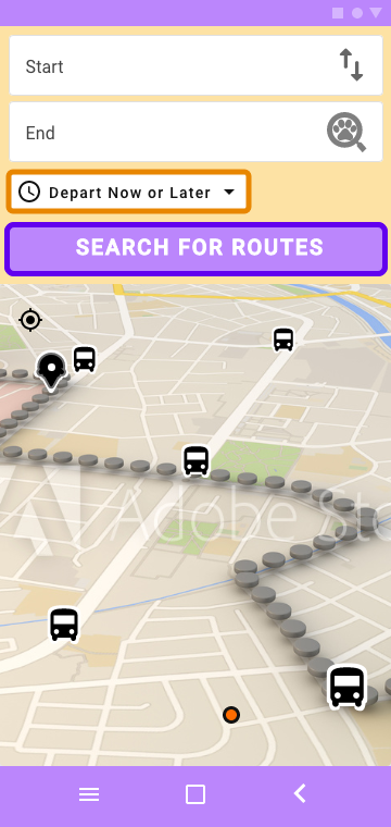
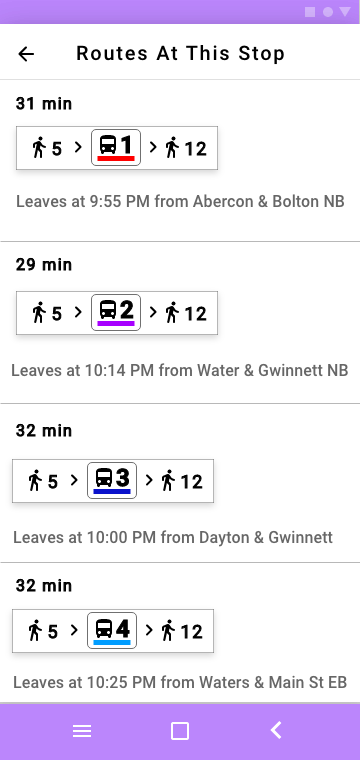
- One-tap trip planning with live arrivals
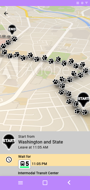
- Cat mascot guide for anxiety-reducing micro-interactions
- Accessibility-first: high contrast, large touch targets, screen reader ready
“Keep it idiot-proof so I can enjoy the ride.”
— Test Participant

Ease of Use
Users reported “feeling less anxious” using public transit
Task Completion
Faster task completion for first-time riders

Usability
2× easier to use vs. competitors (user-reported)
Discovery Process
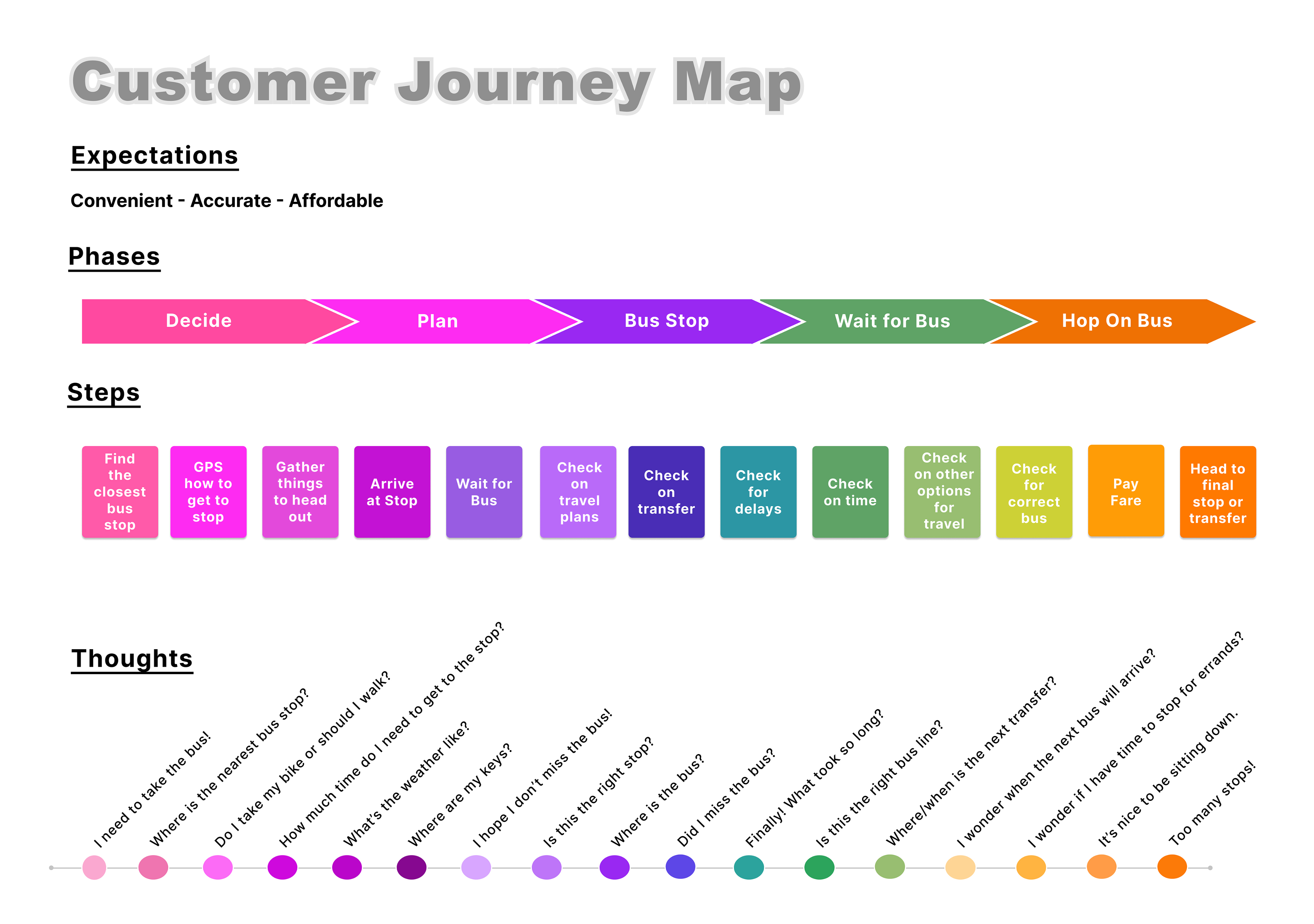
User interviews revealed major pain points: confusing routes, lack of real-time data, fear of “getting lost.”
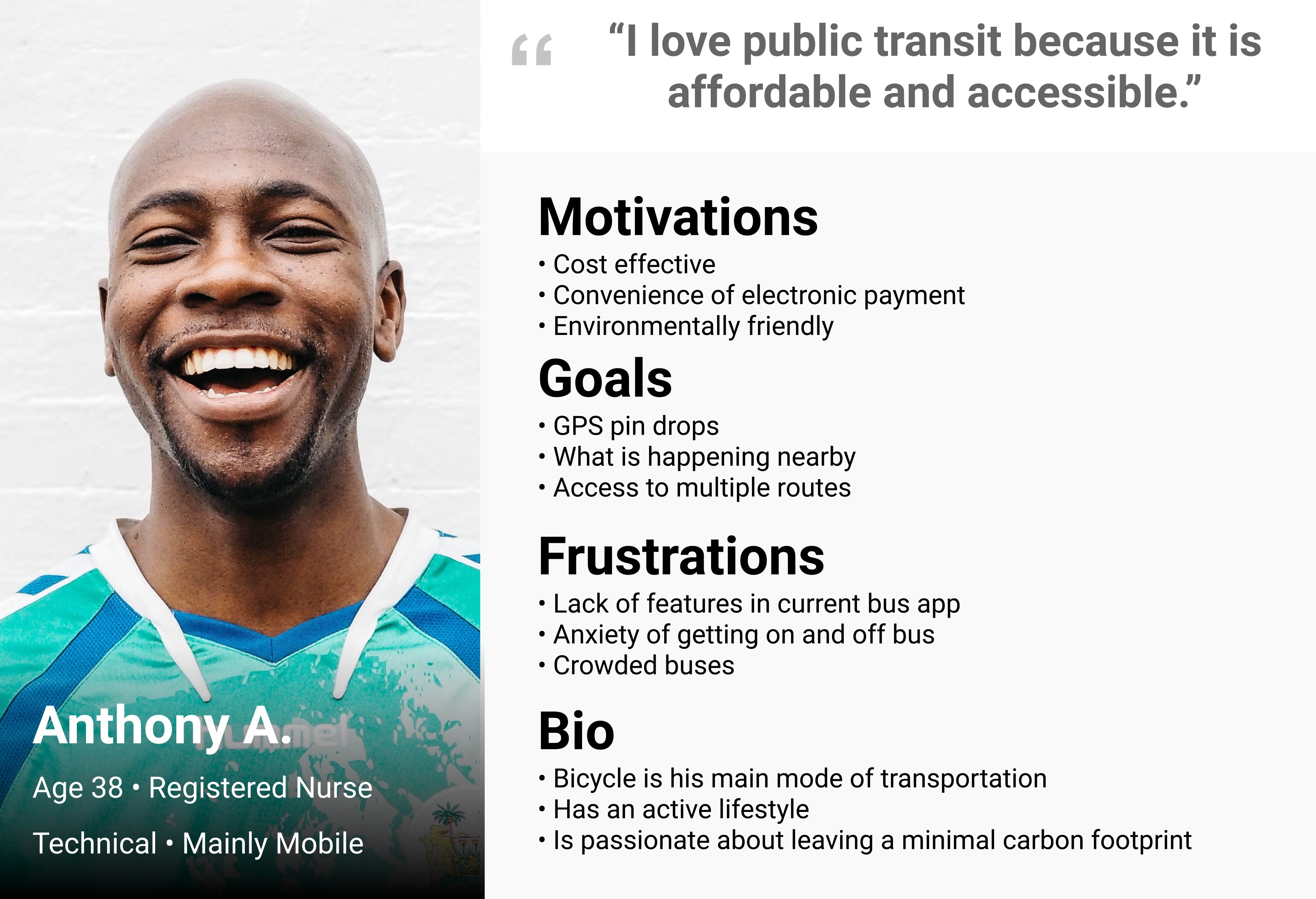
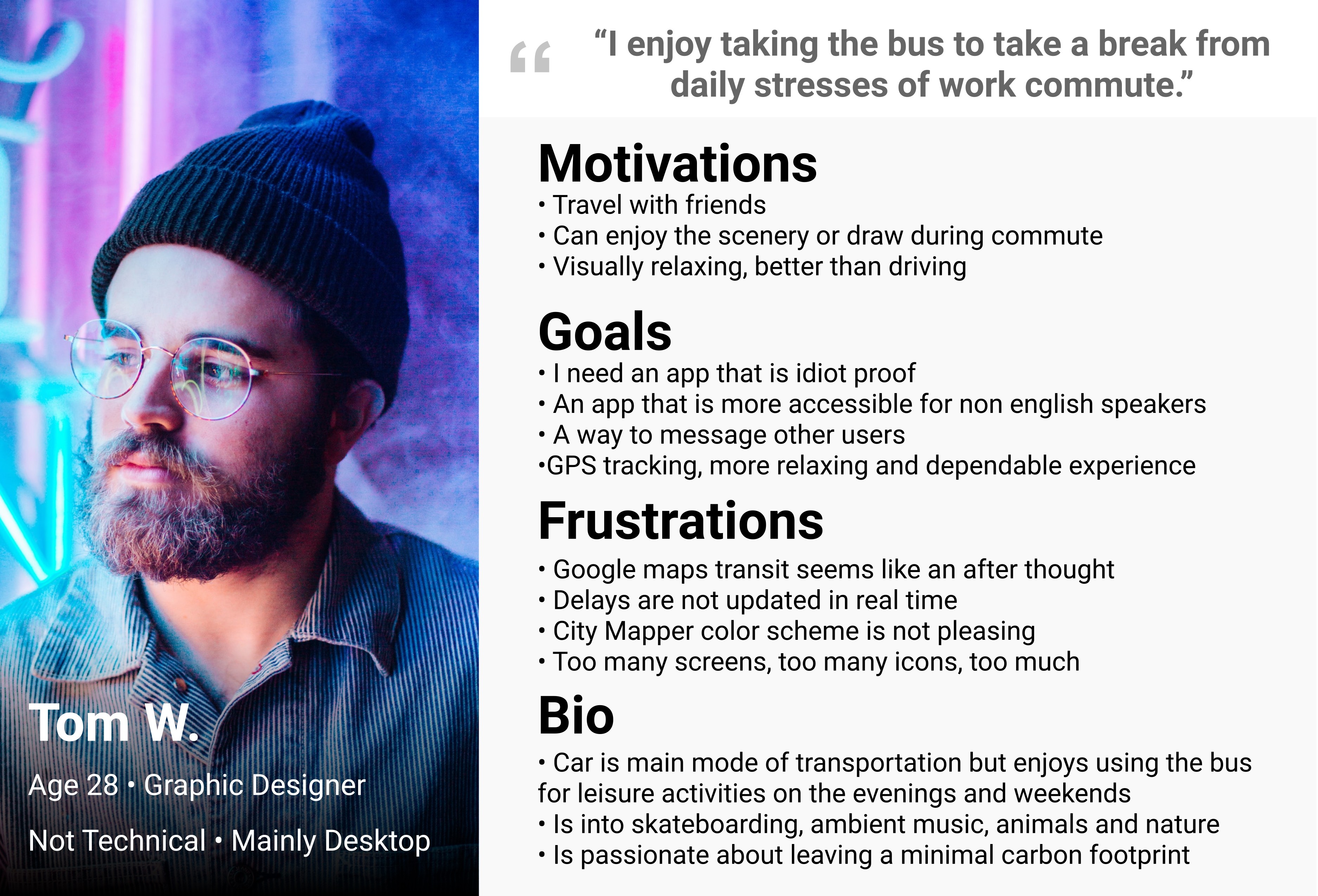
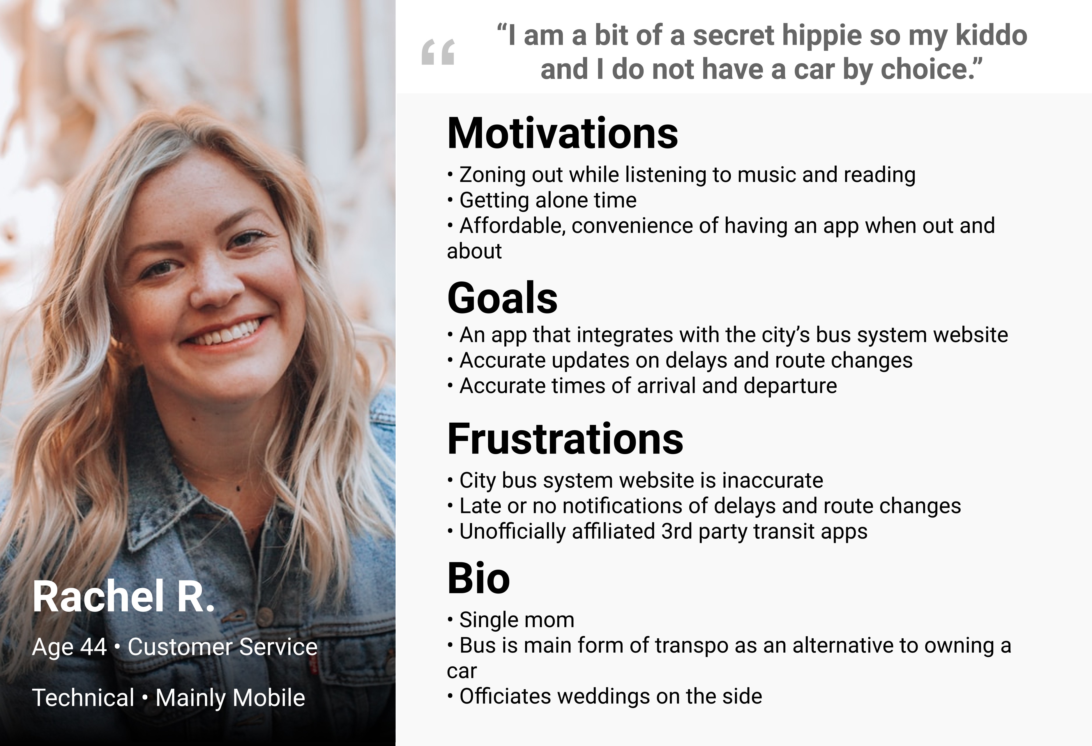
Created Personas from user interviews to help identify pain points and insight into user behavior.
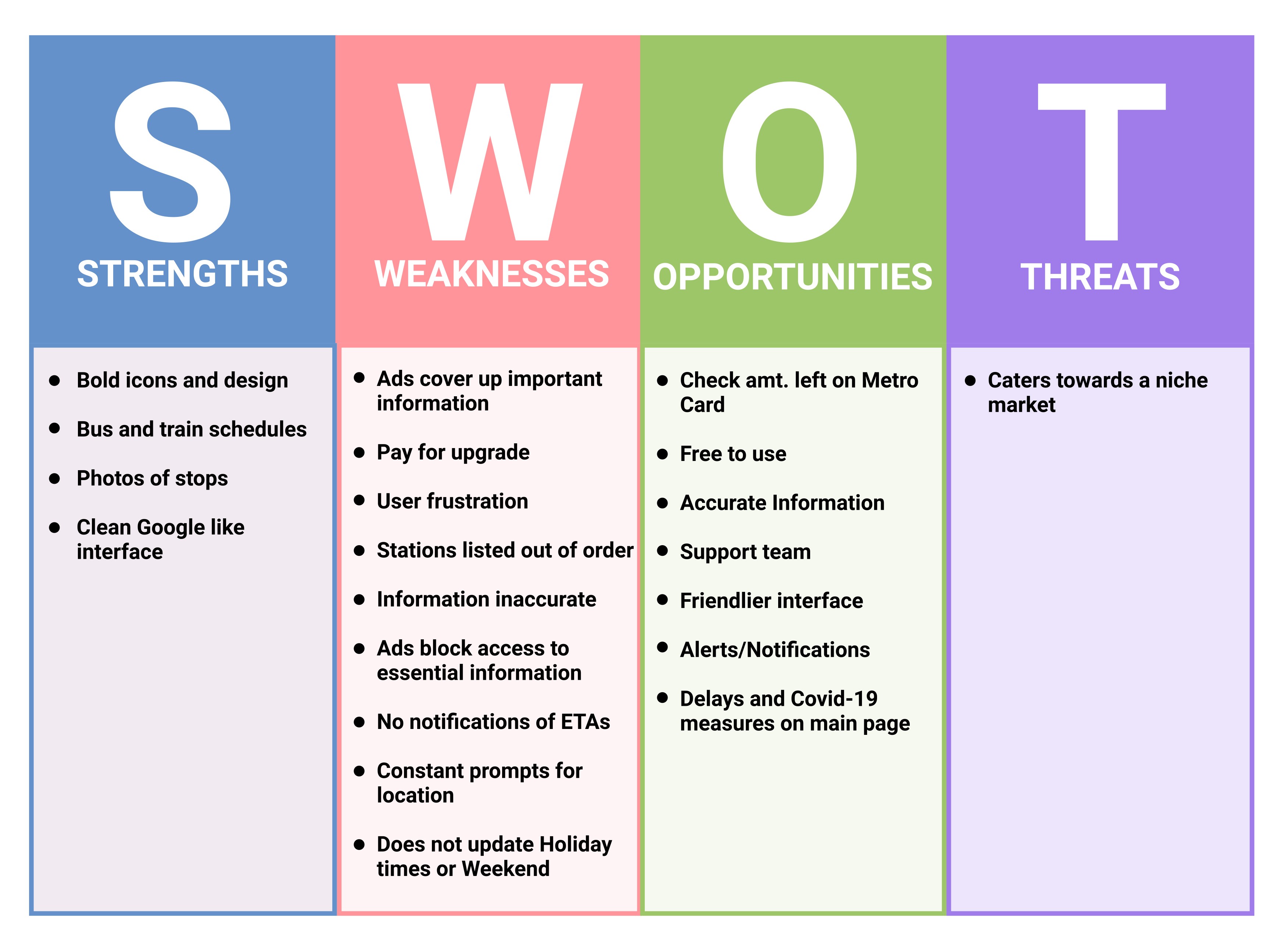
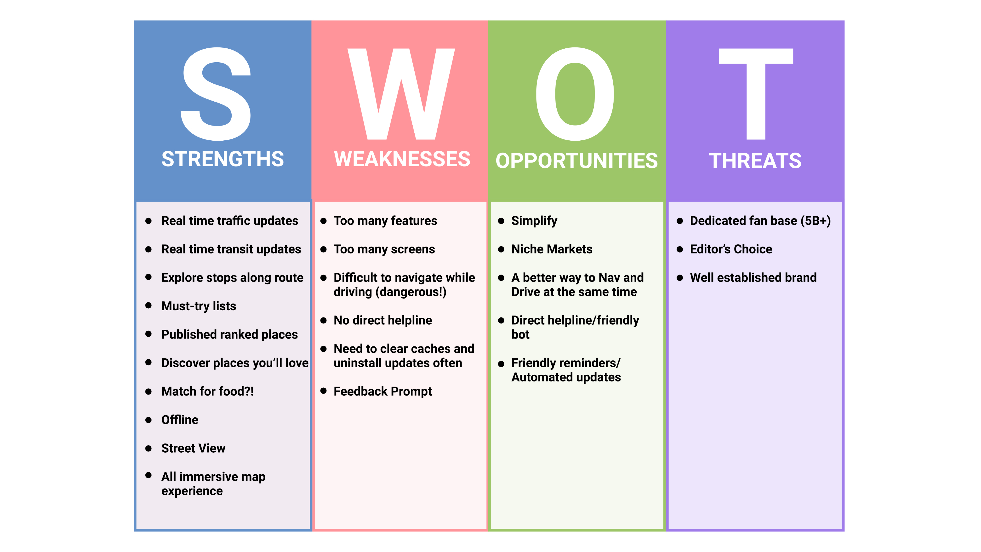
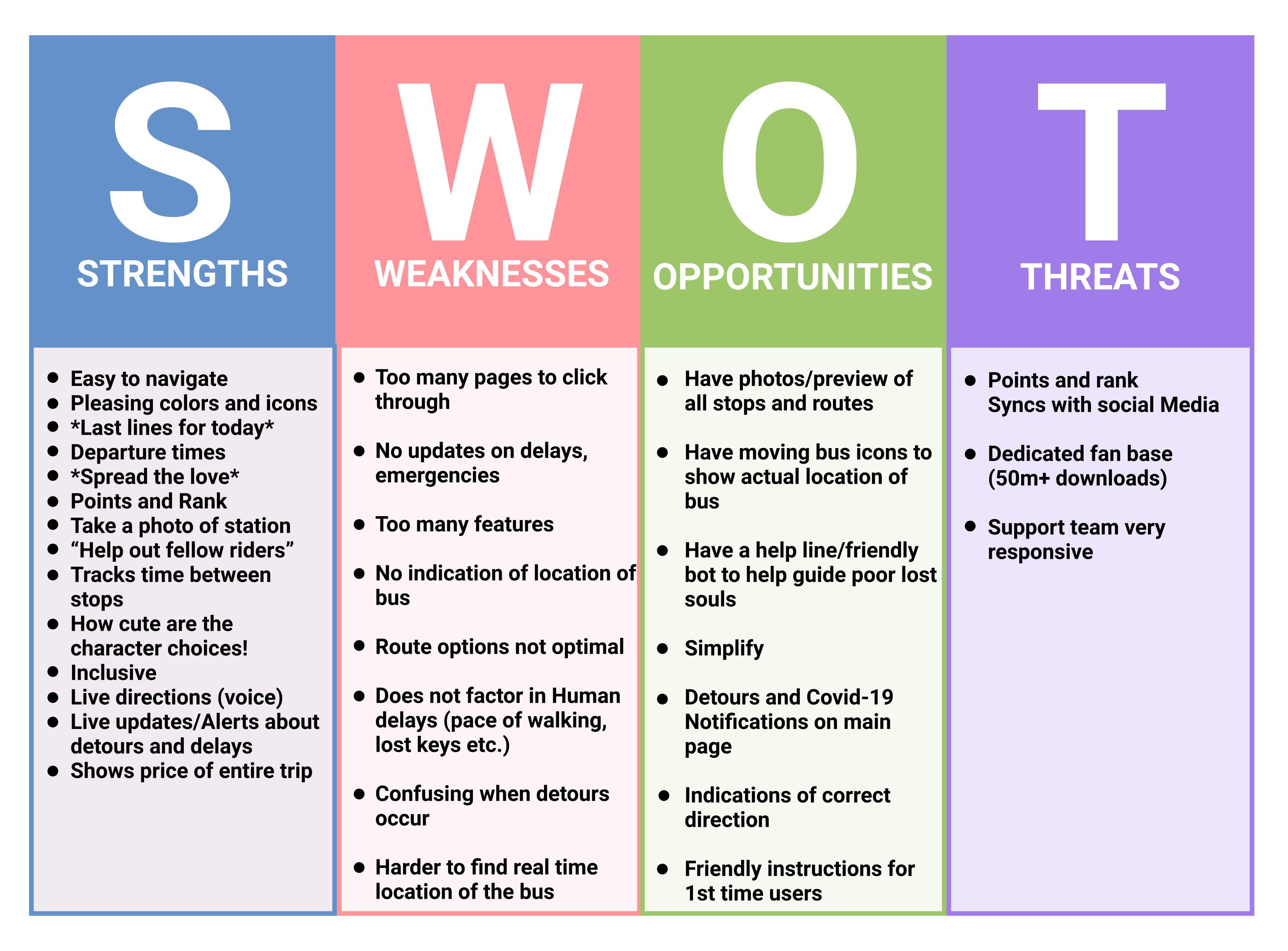
Competitive analysis of top transit apps (like CityMapper and Transit) helped us benchmark must-have features.
We mapped out rider journeys—from planning to riding to arriving—to understand how to reduce friction.
“I love public transit because it’s affordable and accessible.”
-Anthony A., Persona
🧪 Testing + a Failed Concept
Our first concept prioritized detailed route maps and deep customization, but it overwhelmed users. Testers found it too dense for on-the-go usage.
Lesson learned: less is more, especially when users are navigating in motion. We pivoted to a more minimal, story-driven design.
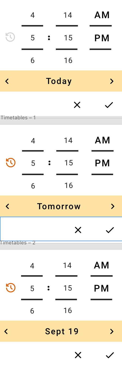
Initial Wireframe
Development of the Cat Bus App through Iteration
Recap
Here’s what people are saying
Cat Bus wasn’t just a design exercise—it was a reminder that utility and delight don’t have to be at odds.
Even serious tools can make people smile, and that’s the kind of design I aim to create.
More Projects
→
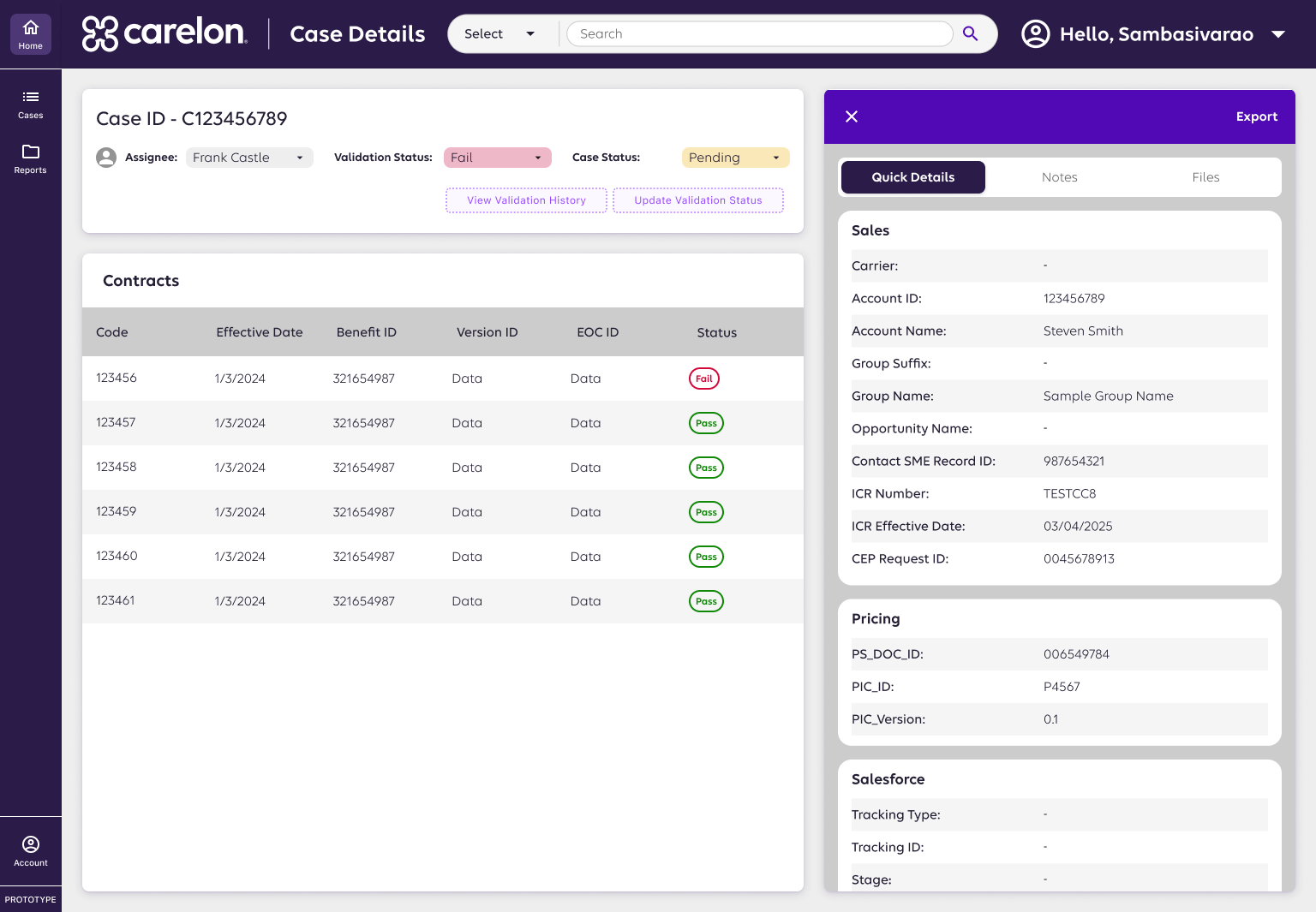
Case Review System
AI-assisted case review redesign improving accuracy, speed, and transparency in pharma validation.
View Case Study
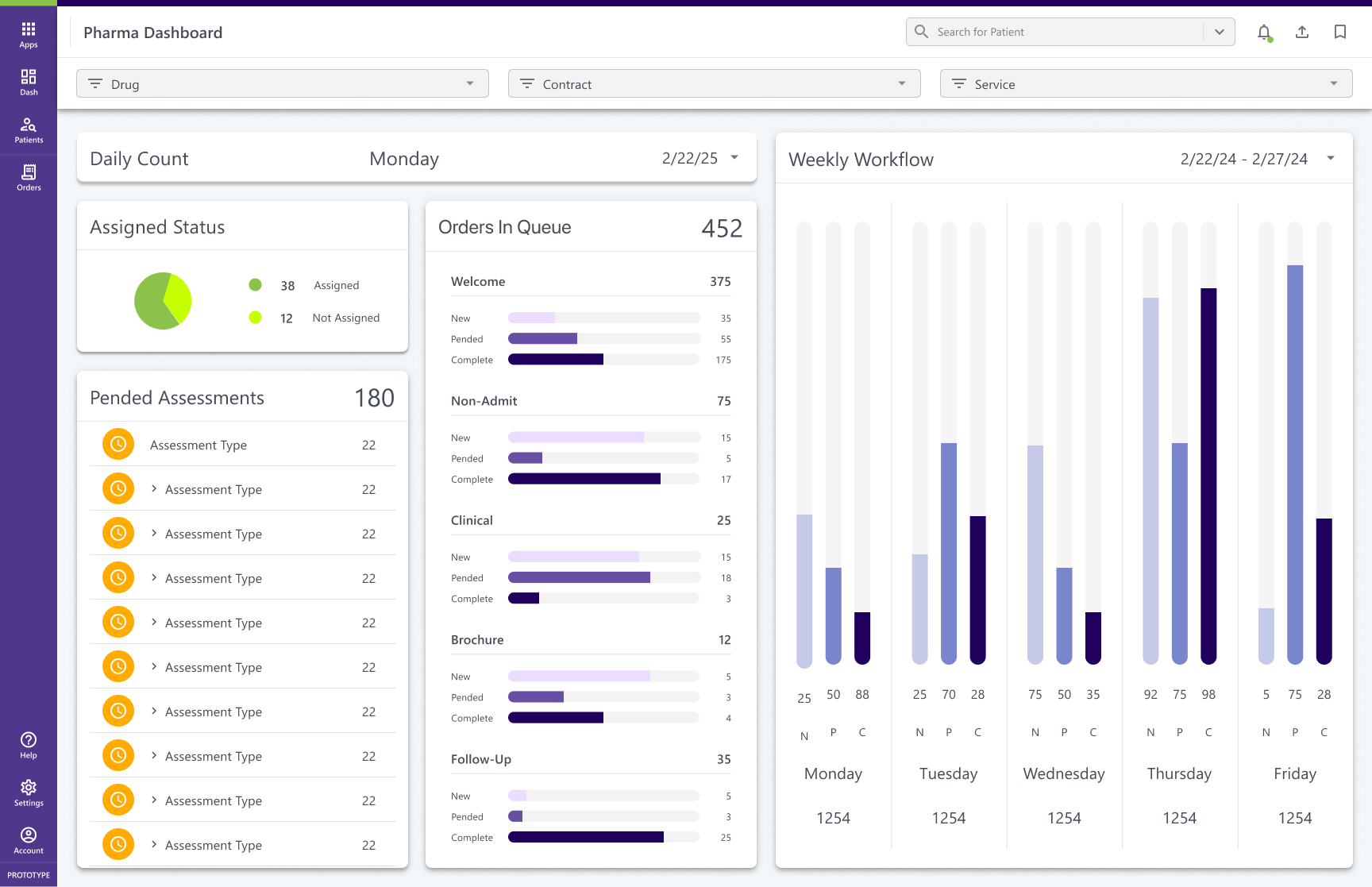
Enterprise Dashboard
Modular KPI dashboards turning fragmented data into actionable insights for partner performance.
View Case Study

Healthcare Platform
Clarified 7 user roles and unified workflows to build a scalable, role-based specialty pharmacy platform.
View Case Study

Healthcare Design Systems
Scaled consistency across 6+ pharmacy products with a modular Figma + Storybook design system.
In Progress
Food Fight
Connected surplus food from restaurants to users, promoting sustainability and affordability.
View Case Study
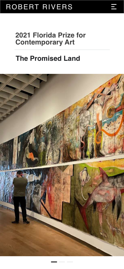
Rivers Redesign
Digital Storytelling for Florida’s Contemporary Artist of the Year
View Case Study
HN
CatBus: A Public Transit Mobile App
Designed a playful, accessible transit app simplifying wayfinding at crowded intersections.
Intro
Cat Bus is a playful, mobile-first transit app designed during a UX Bootcamp. Inspired by Studio Ghibli’s magical realism and the need for accessible, user-friendly public transit tools, the concept was created for a local city bus system with clunky interfaces and poor wayfinding support.
🤠 Role: UX/UI Designer
⏰ Timeline: 2 Weeks
📌 Client: Bootcamp Concept Project (Public Transit App)
🧰 Tools: Figma · Adobe XD · UX Research
🪴 Team: 3 UX Designers
🌏 Deliverables: User Flows · High-Fidelity Prototypes · Transit Map UI · Branding & Mascot Design
Problem
- Existing apps cluttered and intimidating
- Riders feared missing stops or “getting lost”
- Accessibility gaps excluded vulnerable users
Solution
- One-tap trip planning with live arrivals
- Cat mascot guide for anxiety-reducing micro-interactions
- Accessibility-first: high contrast, large touch targets, screen reader ready
“Keep it idiot-proof so I can enjoy the ride.”
— Test Participant
Ease of Use
Users reported “feeling less anxious” using public transit
Task Completion
Faster task completion for first-time riders
Usability
2× easier to use vs. competitors (user-reported)
Discovery Process
User interviews revealed major pain points: confusing routes, lack of real-time data, fear of “getting lost.”
Created Personas from user interviews to help identify pain points and insight into user behavior.
Competitive analysis of top transit apps (like CityMapper and Transit) helped us benchmark must-have features.
We mapped out rider journeys—from planning to riding to arriving—to understand how to reduce friction.
“I love public transit because it’s affordable and accessible.”
-Anthony A., Persona
🧪 Testing + a Failed Concept
Our first concept prioritized detailed route maps and deep customization, but it overwhelmed users. Testers found it too dense for on-the-go usage.
Lesson learned: less is more, especially when users are navigating in motion. We pivoted to a more minimal, story-driven design.
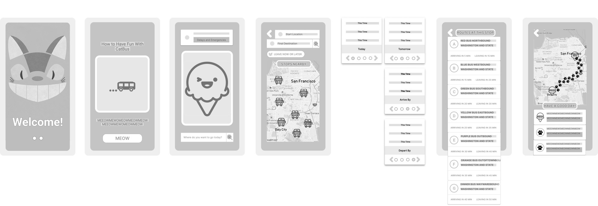
Initial Wireframe
Development of the Cat Bus App through Iteration
Recap
Here’s what people are saying
Cat Bus wasn’t just a design exercise—it was a reminder that utility and delight don’t have to be at odds.
Even serious tools can make people smile, and that’s the kind of design I aim to create.
More Projects
→
Case Review System
AI-assisted case review redesign improving accuracy, speed, and transparency in pharma validation.
View Case Study
Enterprise Dashboard
Modular KPI dashboards turning fragmented data into actionable insights for partner performance.
View Case Study
Healthcare Platform
Clarified 7 user roles and unified workflows to build a scalable, role-based specialty pharmacy platform.
View Case Study
Healthcare Design Systems
Scaled consistency across 6+ pharmacy products with a modular Figma + Storybook design system.
In Progress
Food Fight
Connected surplus food from restaurants to users, promoting sustainability and affordability.
View Case Study
Rivers Redesign
Digital Storytelling for Florida’s Contemporary Artist of the Year
View Case Study
HN
CatBus: A Public Transit Mobile App
Designed a playful, accessible transit app simplifying wayfinding at crowded intersections.
Intro
Cat Bus is a playful, mobile-first transit app designed during a UX Bootcamp. Inspired by Studio Ghibli’s magical realism and the need for accessible, user-friendly public transit tools, the concept was created for a local city bus system with clunky interfaces and poor wayfinding support.
🤠 Role: UX/UI Designer
⏰ Timeline: 2 Weeks
📌 Client: Bootcamp Concept Project (Public Transit App)
🧰 Tools: Figma · Adobe XD · UX Research
🪴 Team: 3 UX Designers
🌏 Deliverables: User Flows · High-Fidelity Prototypes · Transit Map UI · Branding & Mascot Design
Problem
- Existing apps cluttered and intimidating
- Riders feared missing stops or “getting lost”
- Accessibility gaps excluded vulnerable users
Solution
- One-tap trip planning with live arrivals
- Cat mascot guide for anxiety-reducing micro-interactions
- Accessibility-first: high contrast, large touch targets, screen reader ready
“Keep it idiot-proof so I can enjoy the ride.”
— Test Participant
Ease of Use
Users reported “feeling less anxious” using public transit
Task Completion
Faster task completion for first-time riders
Usability
2× easier to use vs. competitors (user-reported)
Discovery Process
User interviews revealed major pain points: confusing routes, lack of real-time data, fear of “getting lost.”
Created Personas from user interviews to help identify pain points and insight into user behavior.
Competitive analysis of top transit apps (like CityMapper and Transit) helped us benchmark must-have features.
We mapped out rider journeys—from planning to riding to arriving—to understand how to reduce friction.
“I love public transit because it’s affordable and accessible.”
-Anthony A., Persona
🧪 Testing + a Failed Concept
Our first concept prioritized detailed route maps and deep customization, but it overwhelmed users. Testers found it too dense for on-the-go usage.
Lesson learned: less is more, especially when users are navigating in motion. We pivoted to a more minimal, story-driven design.
Initial Wireframe
Development of the Cat Bus App through Iteration
Recap
Here’s what people are saying
Cat Bus wasn’t just a design exercise—it was a reminder that utility and delight don’t have to be at odds.
Even serious tools can make people smile, and that’s the kind of design I aim to create.
More Projects
→
Case Review System
AI-assisted case review redesign improving accuracy, speed, and transparency in pharma validation.
View Case Study
Enterprise Dashboard
Modular KPI dashboards turning fragmented data into actionable insights for partner performance.
View Case Study
Healthcare Platform
Clarified 7 user roles and unified workflows to build a scalable, role-based specialty pharmacy platform.
View Case Study
Healthcare Design Systems
Scaled consistency across 6+ pharmacy products with a modular Figma + Storybook design system.
In Progress
Food Fight
Connected surplus food from restaurants to users, promoting sustainability and affordability.
View Case Study
Rivers Redesign
Digital Storytelling for Florida’s Contemporary Artist of the Year
View Case Study