HN
An Enterprise Healthcare Dashboard
Modular KPI dashboards turning fragmented data into actionable insights for partner performance.

*images redacted to respect NDAs
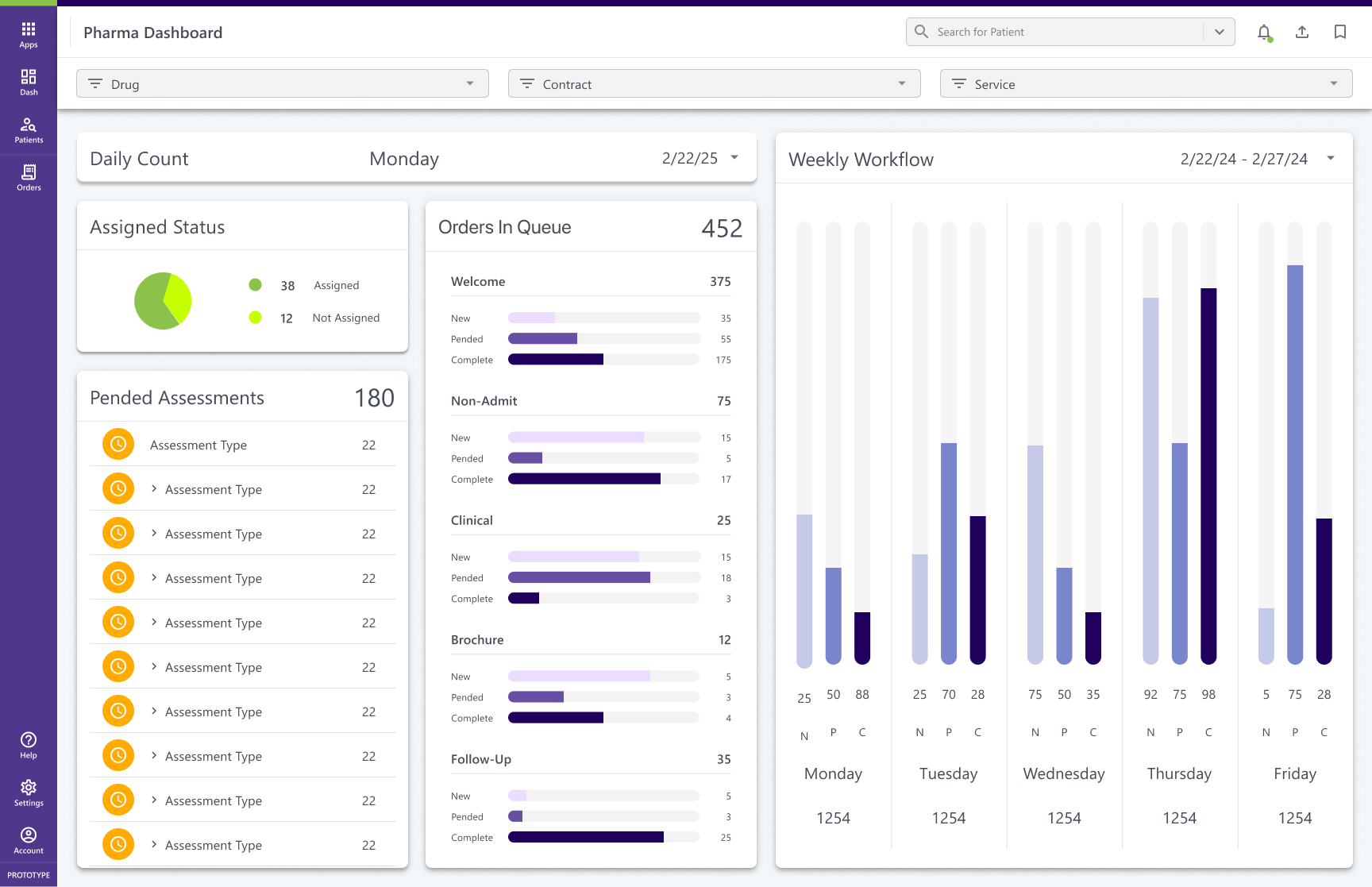
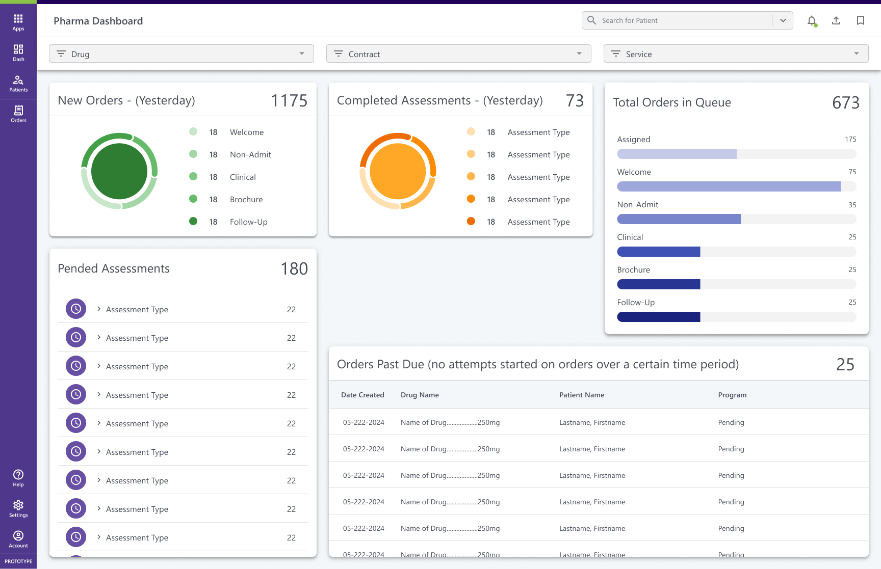
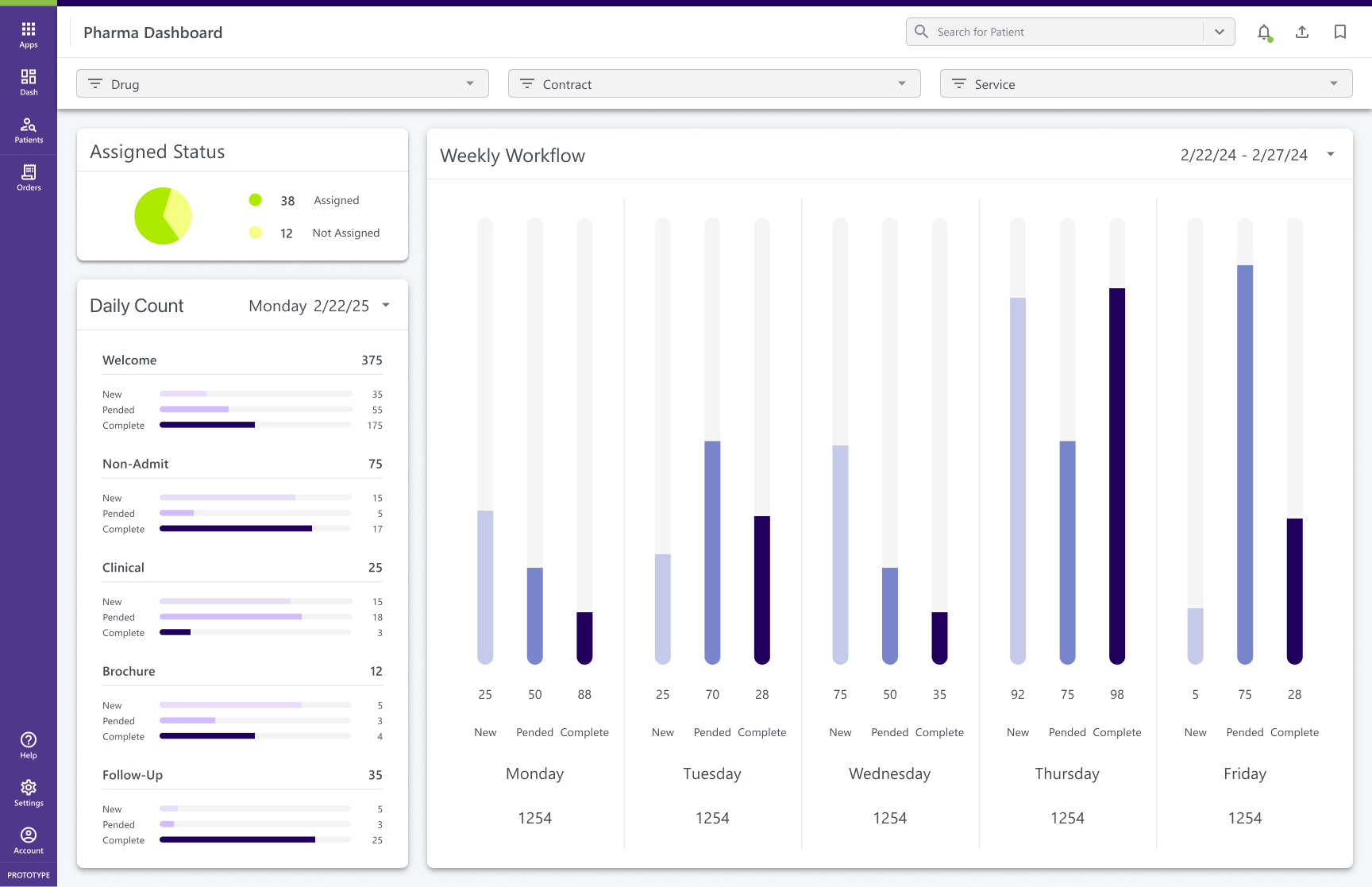
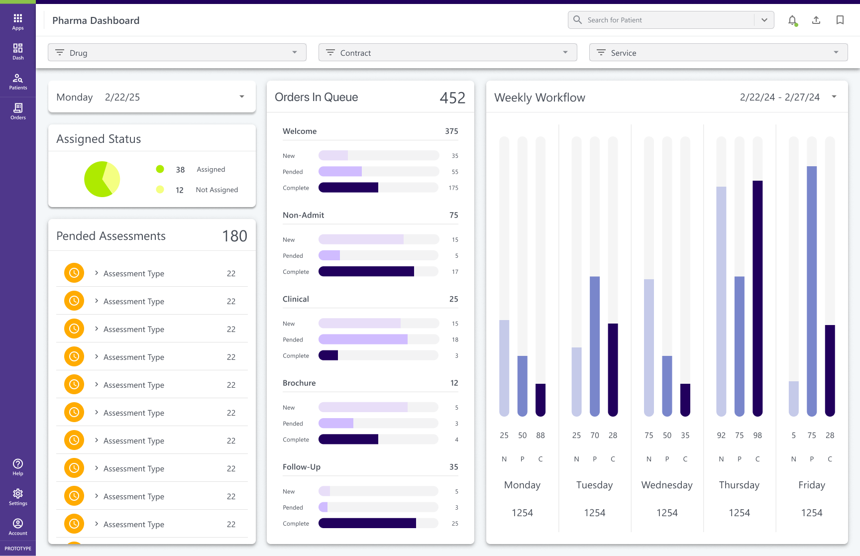
Final Mockup of Healthcare Dashboard
📌 The Challenge
Partner management workflows were fragmented across spreadsheets, emails, and siloed systems.
- Teams lacked visibility into tasks, deadlines, and contract compliance.
- Workload planning was reactive, leading to missed follow-ups and misalignment.
- Leadership hesitated to commit to a unified tool without seeing what was possible.
The lack of a centralized system was causing inefficiency and frustration across the organization.
🤠 Role: UX Designer
⏰ Timeline: ~3 months to MVP
📌 Client: Specialty Pharmacy
🧰 Tools: Figma, research workshops
🪴 Team: Account managers, operations, compliance stakeholders
🌏 Deliverables: Dashboard Design · Workflow Visibility · Strategic Alignment
🎯 The Goal
Design a foundational dashboard that could:
- Give teams a clear, centralized view of workload and partner performance.
- Improve visibility into contracts, compliance, and deadlines.
- Serve as a strategic conversation starter for aligning future tooling needs.
💡 Key Solutions
- Modular Cards: Designed cards for performance, contracts, key contacts, and overdue tasks.
- Interactive Filters: Enabled filtering by drug, service type, manufacturer, and contract.
- Task Timeline: Created a daily/weekly forecasting view to plan workloads proactively.
- Quick Actions: Proposed inline editing and alert-driven triggers to reduce context switching.
- Visual Indicators: Introduced donut and bar charts to highlight workload spikes and compliance gaps.
Although the dashboard was never implemented due to shifting priorities, the design process delivered strategic value 👉

Alignment
Exposed major operational gaps in task ownership and visibility.
Future State
Helped leadership align on future tooling needs and imagine a centralized solution.

UI Patterns
Provided reusable design patterns that informed other initiatives.
Clarity
Showed how thoughtful UX can add clarity and structure even without final delivery.
🔎 My Process
- Stakeholder Interviews: Partnered with account managers, operations, and compliance teams to uncover pain points.
- Workflow Mapping: Documented how tasks were currently tracked and identified blind spots in accountability.
- Research Insights: Synthesized findings into UX requirements such as at-a-glance metrics, role-based views, and quick task reassignment.
- Iteration: Explored multiple dashboard layouts, refining how information was surfaced and how tasks could be prioritized.

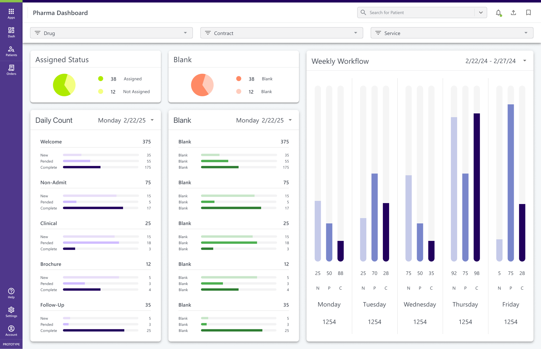
Before
The initial dashboard concepts lacked clear data hierarchy and overwhelmed users with equal-weighted tables, lists, and metrics. Without clear prioritization, it was difficult to quickly assess what mattered most. Early layouts surfaced too much detail at once, forcing users to dig for the insights they needed.
After
Through an iterative design process, we tested variations of layout based on data hierarchy and design principles. Each round refined the balance between detail and overview, gradually reducing noise while surfacing high-value metrics. The final layout prioritized top metrics, giving users a bird’s-eye view of workload and urgent action items. This enabled them to quickly assess what needed to be done and prioritize actions with confidence.
💥 Impact: Improved clarity and reduced decision-making time, helping users identify and act on priorities faster.
🔮 The Outcome
This project reinforced that design provides value beyond shipping features. By visualizing possibilities, I helped stakeholders see a future-state solution, align on priorities, and begin shifting their mindset from reactive workflows to proactive planning.
More Projects
→
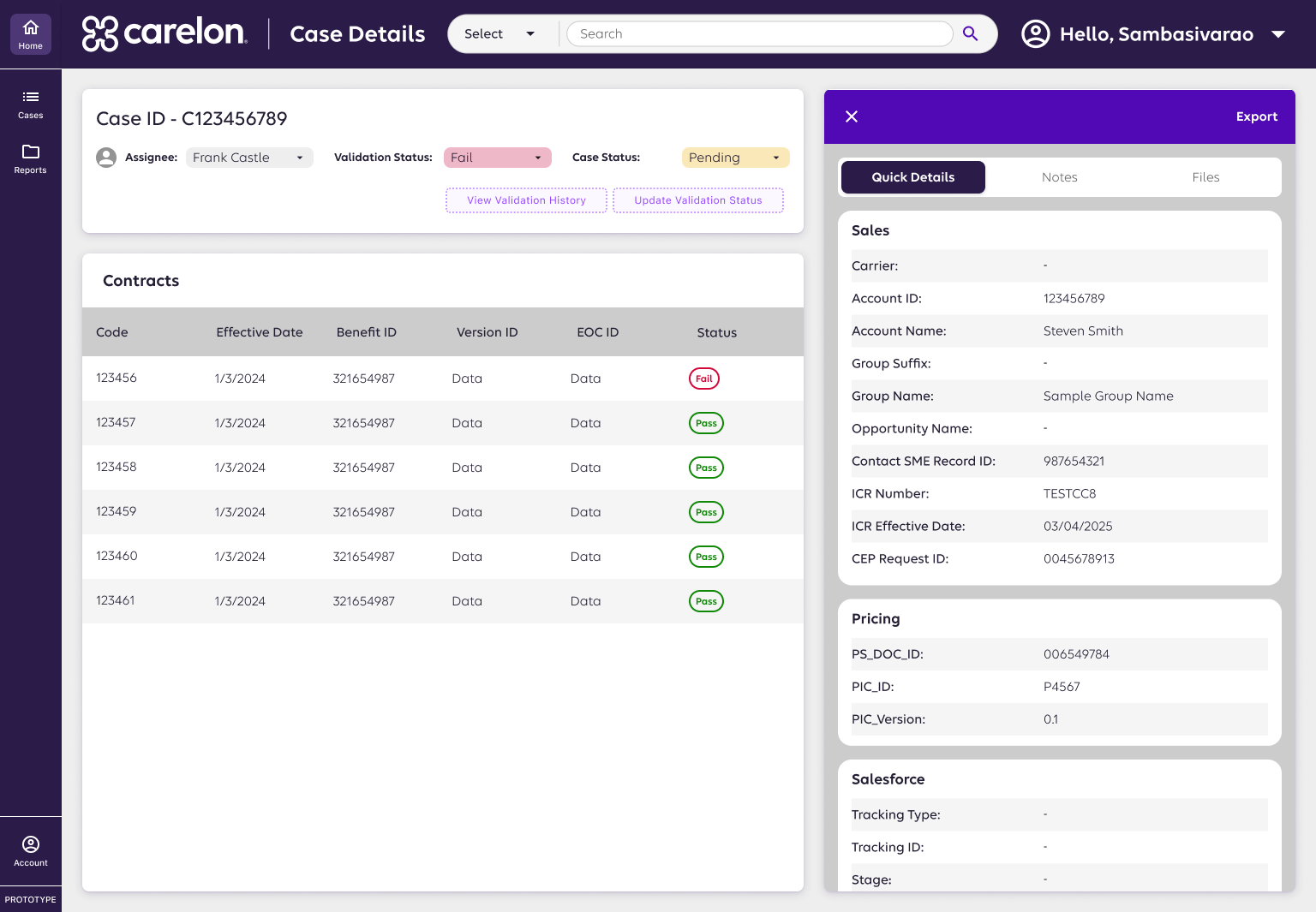
Case Review System
AI-assisted case review redesign improving accuracy, speed, and transparency in pharma validation.
View Case Study

Healthcare Platform
Clarified 7 user roles and unified workflows to build a scalable, role-based specialty pharmacy platform.
View Case Study

Healthcare Design Systems
Scaled consistency across 6+ pharmacy products with a modular Figma + Storybook design system.
In Progress
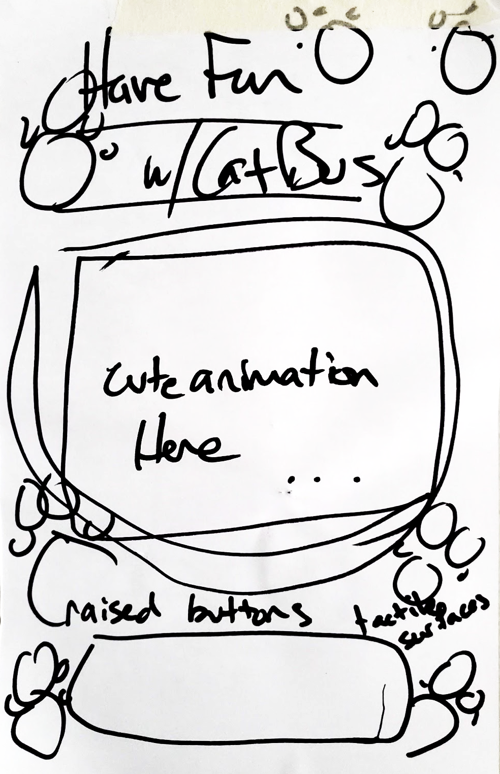
Cat Bus
Designed a playful, accessible transit app simplifying wayfinding at crowded intersections.
View Case Study

Food Fight
Connected surplus food from restaurants to users, promoting sustainability and affordability.
View Case Study
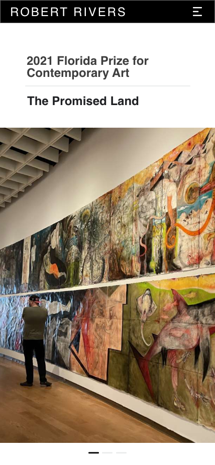
Rivers Redesign
Digital Storytelling for Florida’s Contemporary Artist of the Year
View Case Study
HN
An Enterprise Healthcare Dashboard
Modular KPI dashboards turning fragmented data into actionable insights for partner performance.
*images redacted to respect NDAs
Final Mockup of Healthcare Dashboard
📌 The Challenge
Partner management workflows were fragmented across spreadsheets, emails, and siloed systems.
- Teams lacked visibility into tasks, deadlines, and contract compliance.
- Workload planning was reactive, leading to missed follow-ups and misalignment.
- Leadership hesitated to commit to a unified tool without seeing what was possible.
The lack of a centralized system was causing inefficiency and frustration across the organization.
🤠 Role: UX Designer
⏰ Timeline: ~3 months to MVP
📌 Client: Specialty Pharmacy
🧰 Tools: Figma, research workshops
🪴 Team: Account managers, operations, compliance stakeholders
🌏 Deliverables: Dashboard Design · Workflow Visibility · Strategic Alignment
🎯 The Goal
Design a foundational dashboard that could:
- Give teams a clear, centralized view of workload and partner performance.
- Improve visibility into contracts, compliance, and deadlines.
- Serve as a strategic conversation starter for aligning future tooling needs.
💡 Key Solutions
- Modular Cards: Designed cards for performance, contracts, key contacts, and overdue tasks.
- Interactive Filters: Enabled filtering by drug, service type, manufacturer, and contract.
- Task Timeline: Created a daily/weekly forecasting view to plan workloads proactively.
- Quick Actions: Proposed inline editing and alert-driven triggers to reduce context switching.
- Visual Indicators: Introduced donut and bar charts to highlight workload spikes and compliance gaps.
Although the dashboard was never implemented due to shifting priorities, the design process delivered strategic value 👉
Alignment
Exposed major operational gaps in task ownership and visibility.
Future State
Helped leadership align on future tooling needs and imagine a centralized solution.
UI Patterns
Provided reusable design patterns that informed other initiatives.
Clarity
Showed how thoughtful UX can add clarity and structure even without final delivery.
🔎 My Process
- Stakeholder Interviews: Partnered with account managers, operations, and compliance teams to uncover pain points.
- Workflow Mapping: Documented how tasks were currently tracked and identified blind spots in accountability.
- Research Insights: Synthesized findings into UX requirements such as at-a-glance metrics, role-based views, and quick task reassignment.
- Iteration: Explored multiple dashboard layouts, refining how information was surfaced and how tasks could be prioritized.
Before
The initial dashboard concepts lacked clear data hierarchy and overwhelmed users with equal-weighted tables, lists, and metrics. Without clear prioritization, it was difficult to quickly assess what mattered most. Early layouts surfaced too much detail at once, forcing users to dig for the insights they needed.
After
Through an iterative design process, we tested variations of layout based on data hierarchy and design principles. Each round refined the balance between detail and overview, gradually reducing noise while surfacing high-value metrics. The final layout prioritized top metrics, giving users a bird’s-eye view of workload and urgent action items. This enabled them to quickly assess what needed to be done and prioritize actions with confidence.
💥 Impact: Improved clarity and reduced decision-making time, helping users identify and act on priorities faster.
🔮 The Outcome
This project reinforced that design provides value beyond shipping features. By visualizing possibilities, I helped stakeholders see a future-state solution, align on priorities, and begin shifting their mindset from reactive workflows to proactive planning.
More Projects
→
Case Review System
AI-assisted case review redesign improving accuracy, speed, and transparency in pharma validation.
View Case Study
Healthcare Platform
Clarified 7 user roles and unified workflows to build a scalable, role-based specialty pharmacy platform.
View Case Study
Healthcare Design Systems
Scaled consistency across 6+ pharmacy products with a modular Figma + Storybook design system.
In Progress
Cat Bus
Designed a playful, accessible transit app simplifying wayfinding at crowded intersections.
View Case Study
Food Fight
Connected surplus food from restaurants to users, promoting sustainability and affordability.
View Case Study
Rivers Redesign
Digital Storytelling for Florida’s Contemporary Artist of the Year
View Case Study