HN
Redesigning a Pharmacy Case Review System
AI-assisted case review redesign improving accuracy, speed, and transparency in pharma validation.

*images redacted to respect NDAs
Case Review Workflow
📌 The Challenge
A healthcare dashboard used for case review and validation had become cluttered and overwhelming.
- Critical data (sales, pricing, tracking) was scattered and repeated.
- Users struggled with redundant scanning, unclear terminology, and slow workflows.
- Engineers faced mounting technical debt from inconsistent layouts.
The system needed a redesign that balanced usability, scalability, and engineering structure.
🤠 Role: UX Designer (sole)
⏰ Timeline: ~3 months to MVP
📌 Client: Retail Pharmacy
🧰 Tools: Figma, Angular, Salesforce Design System
🪴 Team: Product Manager, system analyst, developers, stakeholders
🌏 Deliverables: Enterprise Workflow Design · Object-Oriented UI Patterns · Data Visualization
🎯 The Goal
Create a streamlined, future-proof case review interface that:
- Prioritizes the most relevant data for quick decisions.
- Reduces cognitive load with clear hierarchy and language.
- Uses object-oriented UI patterns to align with engineering models.
📌 The Challenge
- Smart Component Use: Introduced modular components (expandable drawers, tables, modals) to simplify workflows.
- Prioritized Information: Surfaced key metrics (status, pricing, sales data) upfront, with deeper details only when needed.
- Interaction Improvements: Added features like an audit trail (“who did what and when”), file uploads with visibility, and CSV export for power users.
- Consistent Language: Standardized terminology to reduce confusion across teams.
“Huong’s design strategy streamlined our workflows and saved the team nearly ten weeks of development rework. Her guidance on reusable patterns and clear documentation gave engineering a roadmap that let us deliver faster with fewer errors.”
— Project Lead

Reduced Manual Errors
Cut redundant scanning by 30%, improving speed and reducing errors.
Team Alignment
Increased team alignment with clear design rationale + engineering fit.

UI Patterns
Freed up engineering bandwidth by using reusable, scalable patterns.
Stakeholder Support
Earned strong stakeholder support, leading to expansion of design responsibilities.
🔎 My Process
- Research & Analysis: Interviewed stakeholders and subject matter experts to surface pain points.
- Information Architecture: Categorized data into primary, secondary, and tertiary levels for clarity.
- Prototyping: Explored multiple layouts, including a single-scroll version (ultimately rejected for being overwhelming).
- Testing & Iteration: Pivoted to a componentized, collapsible layout using tabs and drawers for digestibility.

Before
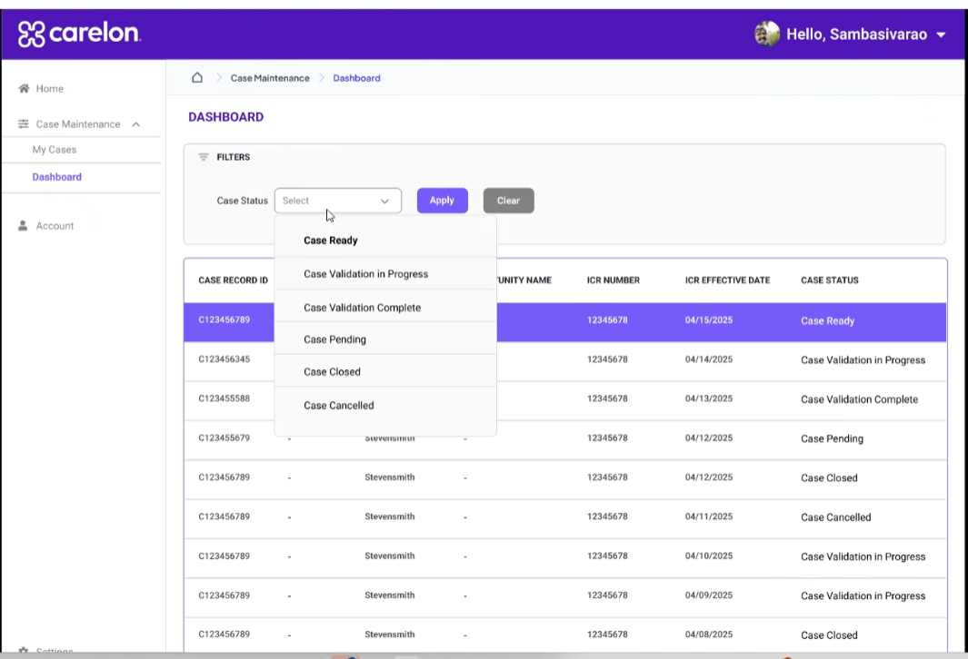
The dashboard was text-heavy and repetitive, with no visual indicators or filters. Users struggled to see priorities, track progress, or export data, leading to slow and error-prone workflows.
Case Details
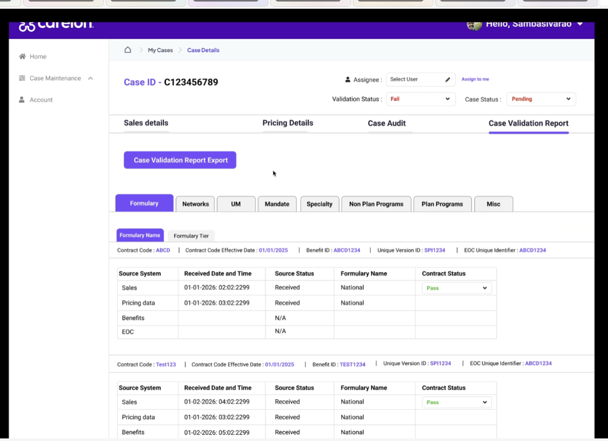
Case details lived on a long, scrollable page with no visual hierarchy. Users struggled to scan or locate key information quickly.
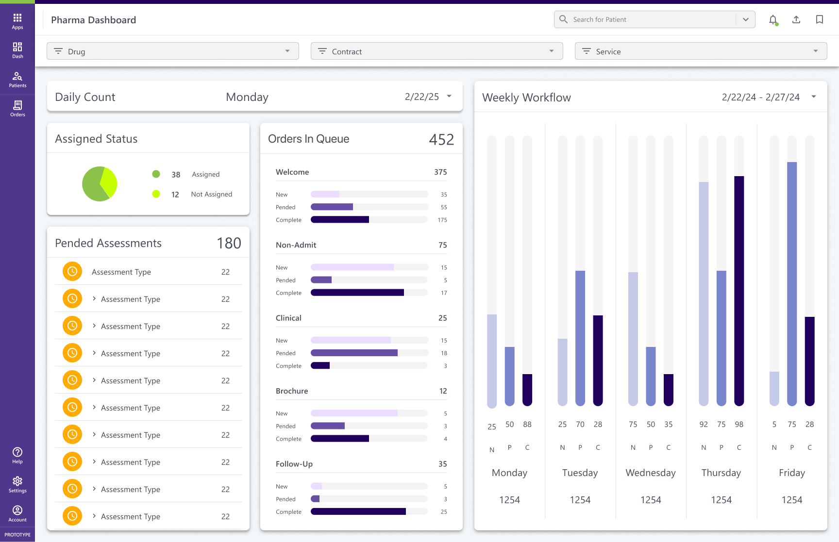
After
Dashboard
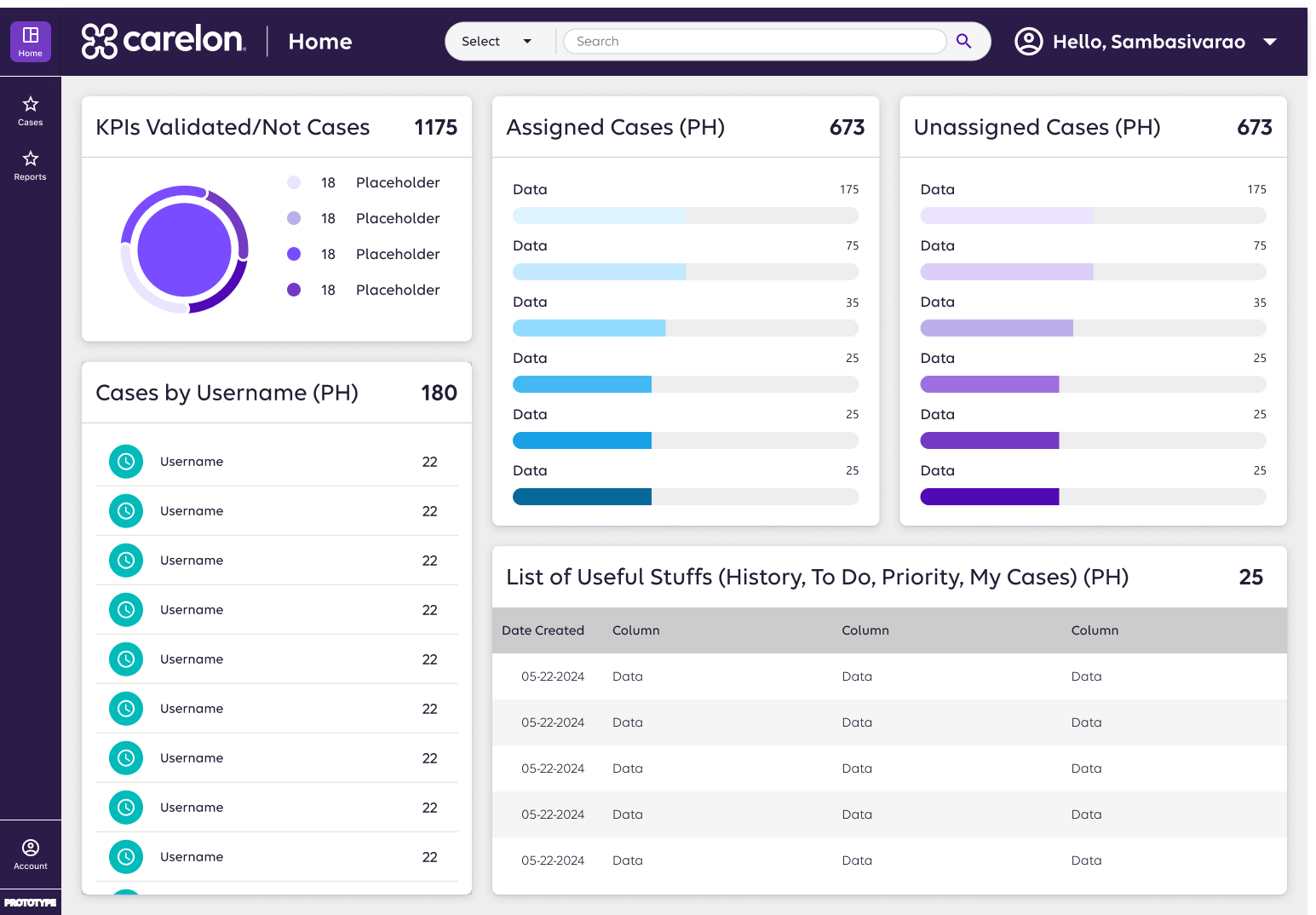
A streamlined layout introduced visual status cues, filters, and reusable components. Teams could scan cases quickly, track progress, and export data with ease—cutting redundant work by 30%.
Case Details
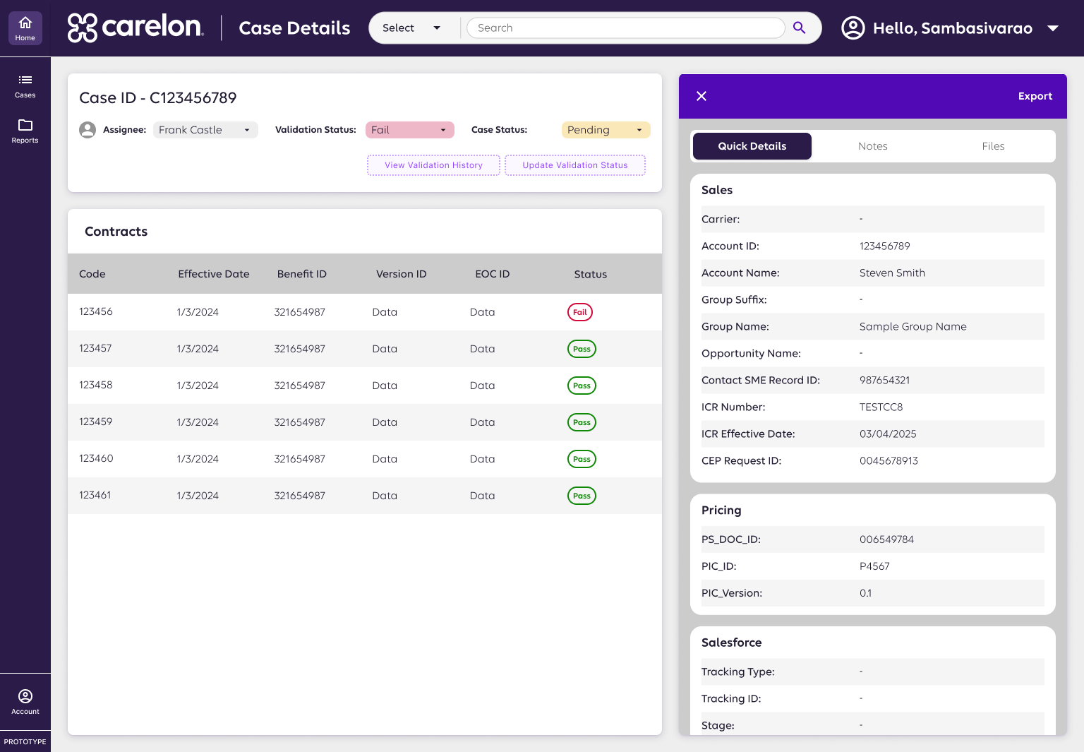
I reorganized content into primary, secondary, and tertiary categories, then introduced a reusable quick details panel. This made critical info easy to find and adaptable across workflows like tables and csv export.
🔮 The Outcome
The redesign transformed a high-friction legacy system into a scalable, structured interface. By aligning user needs, business goals, and technical architecture, the project set a new standard for how complex healthcare data can be made clear, actionable, and future-ready.
More Projects
→
Enterprise Dashboard
Modular KPI dashboards turning fragmented data into actionable insights for partner performance.
View Case Study

Healthcare Platform
Clarified 7 user roles and unified workflows to build a scalable, role-based specialty pharmacy platform.
View Case Study

Healthcare Design Systems
Scaled consistency across 6+ pharmacy products with a modular Figma + Storybook design system.
In Progress
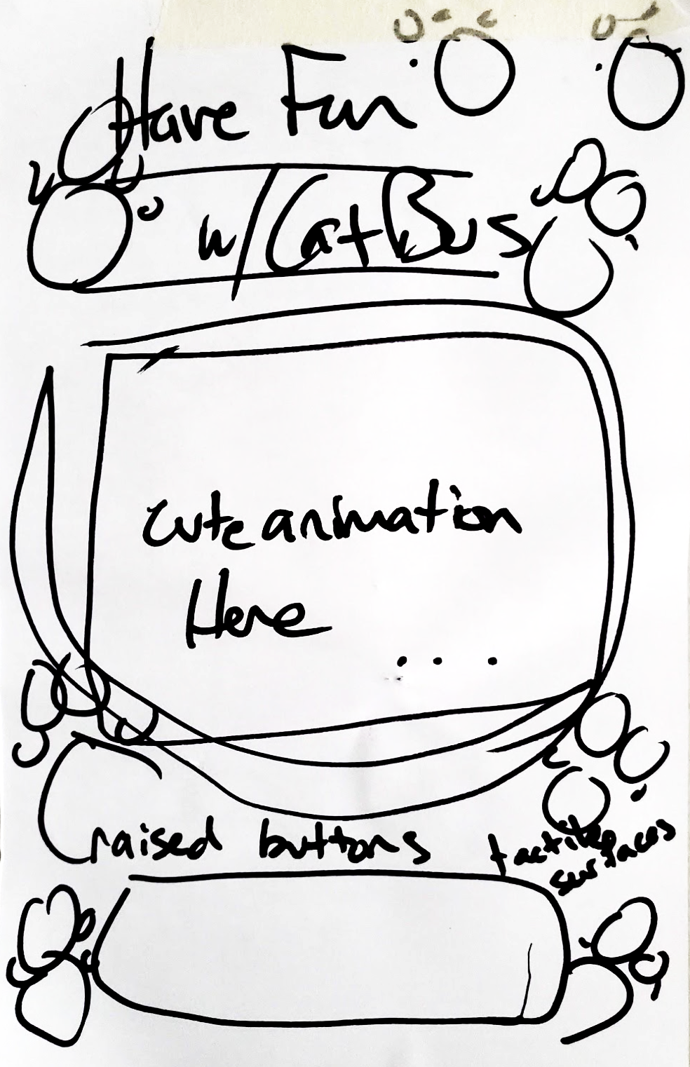
Cat Bus
Designed a playful, accessible transit app simplifying wayfinding at crowded intersections.
View Case Study

Food Fight
Connected surplus food from restaurants to users, promoting sustainability and affordability.
View Case Study

Rivers Redesign
Digital Storytelling for Florida’s Contemporary Artist of the Year
View Case Study
HN
Redesigning a Pharmacy Case Review System
AI-assisted case review redesign improving accuracy, speed, and transparency in pharma validation.
*images redacted to respect NDAs
Case Review Workflow
📌 The Challenge
A healthcare dashboard used for case review and validation had become cluttered and overwhelming.
- Critical data (sales, pricing, tracking) was scattered and repeated.
- Users struggled with redundant scanning, unclear terminology, and slow workflows.
- Engineers faced mounting technical debt from inconsistent layouts.
The system needed a redesign that balanced usability, scalability, and engineering structure.
🤠 Role: UX Designer (sole)
⏰ Timeline: ~3 months to MVP
📌 Client: Retail Pharmacy
🧰 Tools: Figma, Angular, Salesforce Design System
🪴 Team: Product Manager, system analyst, developers, stakeholders
🌏 Deliverables: Enterprise Workflow Design · Object-Oriented UI Patterns · Data Visualization
🎯 The Goal
Create a streamlined, future-proof case review interface that:
- Prioritizes the most relevant data for quick decisions.
- Reduces cognitive load with clear hierarchy and language.
- Uses object-oriented UI patterns to align with engineering models.
📌 The Challenge
- Smart Component Use: Introduced modular components (expandable drawers, tables, modals) to simplify workflows.
- Prioritized Information: Surfaced key metrics (status, pricing, sales data) upfront, with deeper details only when needed.
- Interaction Improvements: Added features like an audit trail (“who did what and when”), file uploads with visibility, and CSV export for power users.
- Consistent Language: Standardized terminology to reduce confusion across teams.
“Huong’s design strategy streamlined our workflows and saved the team nearly ten weeks of development rework. Her guidance on reusable patterns and clear documentation gave engineering a roadmap that let us deliver faster with fewer errors.”
— Project Lead
Reduced Manual Errors
Cut redundant scanning by 30%, improving speed and reducing errors.
Team Alignment
Increased team alignment with clear design rationale + engineering fit.
UI Patterns
Freed up engineering bandwidth by using reusable, scalable patterns.
Stakeholder Support
Earned strong stakeholder support, leading to expansion of design responsibilities.
🔎 My Process
- Research & Analysis: Interviewed stakeholders and subject matter experts to surface pain points.
- Information Architecture: Categorized data into primary, secondary, and tertiary levels for clarity.
- Prototyping: Explored multiple layouts, including a single-scroll version (ultimately rejected for being overwhelming).
- Testing & Iteration: Pivoted to a componentized, collapsible layout using tabs and drawers for digestibility.
Before
Dashboard
The dashboard was text-heavy and repetitive, with no visual indicators or filters. Users struggled to see priorities, track progress, or export data, leading to slow and error-prone workflows.
Case Details
Case details lived on a long, scrollable page with no visual hierarchy. Users struggled to scan or locate key information quickly.
After
Dashboard
A streamlined layout introduced visual status cues, filters, and reusable components. Teams could scan cases quickly, track progress, and export data with ease—cutting redundant work by 30%.
Case Details
I reorganized content into primary, secondary, and tertiary categories, then introduced a reusable quick details panel. This made critical info easy to find and adaptable across workflows like tables and csv export.
🔮 The Outcome
The redesign transformed a high-friction legacy system into a scalable, structured interface. By aligning user needs, business goals, and technical architecture, the project set a new standard for how complex healthcare data can be made clear, actionable, and future-ready.
More Projects
→
Enterprise Dashboard
Modular KPI dashboards turning fragmented data into actionable insights for partner performance.
View Case Study
Healthcare Platform
Clarified 7 user roles and unified workflows to build a scalable, role-based specialty pharmacy platform.
View Case Study
Healthcare Design Systems
Scaled consistency across 6+ pharmacy products with a modular Figma + Storybook design system.
In Progress
Cat Bus
Designed a playful, accessible transit app simplifying wayfinding at crowded intersections.
View Case Study
Food Fight
Connected surplus food from restaurants to users, promoting sustainability and affordability.
View Case Study
Rivers Redesign
Digital Storytelling for Florida’s Contemporary Artist of the Year
View Case Study