HN
Health Smart Dashboard
A focused, metrics-first dashboard for physical therapists and clinic staff
Health Smart Dashboard Prototype Walkthrough
Summary
I led a one-week sprint to design a SaaS EHR dashboard that unified fragmented clinical workflows across 200+ clinics. By focusing on intelligent prioritization instead of data overload, I reduced decision fatigue and improved care coordination.

🤠 Role: Product Designer (Design Challenge)
⏰ Timeline: 1 Week
📌 Client: SaaS EHR Platform for Small Clinics
🧰 Tools: Figma · Video Walkthrough · UX Audit
🪴 Team: Sole UX Designer
🌏 Deliverables: Interactive Prototype · Case Video · UI Animations · Design Rationale
Problem
- Clinical staff lost 2.3 hours daily across 4+ disconnected systems
- Scattered treatment data created errors and fatigue
- Workload prevented clinics from scaling patient capacity
Solution
- Designed modular card system surfacing the right info at the right time
- Introduced triage, pipeline, and context cards for role-based prioritization
- Built smart actions for bulk operations and one-click access
Impact


Cut through the noise:
Users went from piecing together 3+ systems to seeing their daily priorities in one glance.
Created team-wide alignment
Facilitated better handoffs and transparency.

Design
The design system and modular UI patterns created a scalable foundation for other teams.
Discovery Process
Development of Health Smart Dashboard through UX Research
Context-Gathering
- Researched clinical staff, PMs, and developer needs
- Mapped out current tools and pain points
- Identified key data points users checked first thing each day
User needs synthesis
- What do I need to know?
- What do I need to do?
- Translated these into prioritized information hierarchy
- → Daily count of true baselines and follow-ups
- → Pending tasks
- → Assessment status per patient
Before & After

Development of Health Smart Dashboard through Iteration
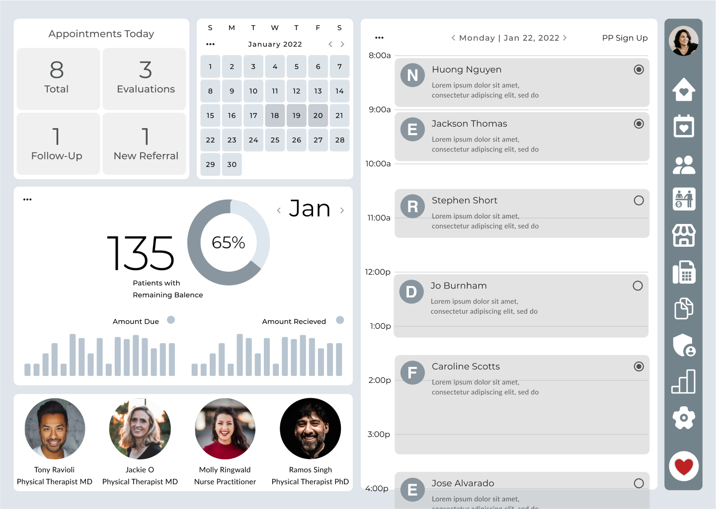
Before - Modular, card-based dashboard
- Segmented views for Tasks, Baseline, Follow-up
- Visual trend indicators (daily counts, overdue, due today)
- Quick actions linked to relevant patient records

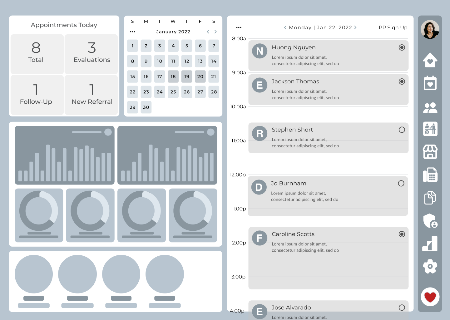
After - Designed for scalability and system alignment
- Used enterprise table UI patterns
- Prioritized simplicity over feature bloat
- Paired designs with dev-ready component specs

Reflection & Impact
Here’s what people are saying
This project showed the power of restraint in dashboard design.
Instead of trying to show everything, we focused on just enough information to move the day forward.
The result? A design that works harder by doing less.
HN
Health Smart Dashboard
A focused, metrics-first dashboard for physical therapists and clinic staff
Health Smart Dashboard Prototype Walkthrough
Summary
I led a one-week sprint to design a SaaS EHR dashboard that unified fragmented clinical workflows across 200+ clinics. By focusing on intelligent prioritization instead of data overload, I reduced decision fatigue and improved care coordination.
🤠 Role: Product Design Challenge
⏰ Timeline: 1 Week
📌 Client: SaaS EHR Platform for Small Clinics
🧰 Tools: Figma · Video Walkthrough · UX Audit
🪴 Team: Sole UX Designer
🌏 Deliverables: Interactive Prototype · Case Video · UI Animations · Design Rationale
Problem
- Clinical staff lost 2.3 hours daily across 4+ disconnected systems
- Scattered treatment data created errors and fatigue
- Workload prevented clinics from scaling patient capacity
Solution
- Designed modular card system surfacing the right info at the right time
- Introduced triage, pipeline, and context cards for role-based prioritization
- Built smart actions for bulk operations and one-click access
Impact
Cut through the noise:
Users went from piecing together 3+ systems to seeing their daily priorities in one glance.
Created team-wide alignment
Facilitated better handoffs and transparency.
Design
The design system and modular UI patterns created a scalable foundation for other teams.
Discovery Process
Development of Health Smart Dashboard through UX Research
Context-Gathering
- Researched clinical staff, PMs, and developer needs
- Mapped out current tools and pain points
- Identified key data points users checked first thing each day
User needs synthesis
- What do I need to know?
- What do I need to do?
- Translated these into prioritized information hierarchy
- → Daily count of true baselines and follow-ups
- → Pending tasks
- → Assessment status per patient
Before & After
Development of Health Smart Dashboard through Iteration
Before - Modular, card-based dashboard
- Segmented views for Tasks, Baseline, Follow-up
- Visual trend indicators (daily counts, overdue, due today)
- Quick actions linked to relevant patient records
After - Designed for scalability and system alignment
- Used enterprise table UI patterns
- Prioritized simplicity over feature bloat
- Paired designs with dev-ready component specs
Reflection & Impact
Here’s what people are saying
This project showed the power of restraint in dashboard design.
Instead of trying to show everything, we focused on just enough information to move the day forward.
The result? A design that works harder by doing less.
HN
Health Smart Dashboard
A focused, metrics-first dashboard for physical therapists and clinic staff
Health Smart Dashboard Prototype Walkthrough
Summary
I led a one-week sprint to design a SaaS EHR dashboard that unified fragmented clinical workflows across 200+ clinics. By focusing on intelligent prioritization instead of data overload, I reduced decision fatigue and improved care coordination.
🤠 Role: Product Designer (Design Challenge)
⏰ Timeline: 1 Week
📌 Client: SaaS EHR Platform for Small Clinics
🧰 Tools: Figma · Video Walkthrough · UX Audit
🪴 Team: Sole UX Designer
🌏 Deliverables: Interactive Prototype · Case Video · UI Animations · Design Rationale
Problem
- Clinical staff lost 2.3 hours daily across 4+ disconnected systems
- Scattered treatment data created errors and fatigue
- Workload prevented clinics from scaling patient capacity
Solution
- Designed modular card system surfacing the right info at the right time
- Introduced triage, pipeline, and context cards for role-based prioritization
- Built smart actions for bulk operations and one-click access
Impact
Cut through the noise:
Users went from piecing together 3+ systems to seeing their daily priorities in one glance.
Created team-wide alignment
Facilitated better handoffs and transparency.
Design
The design system and modular UI patterns created a scalable foundation for other teams.
Discovery Process
Development of Health Smart Dashboard through UX Research
Context-Gathering
- Researched clinical staff, PMs, and developer needs
- Mapped out current tools and pain points
- Identified key data points users checked first thing each day
User needs synthesis
- What do I need to know?
- What do I need to do?
- Translated these into prioritized information hierarchy
- → Daily count of true baselines and follow-ups
- → Pending tasks
- → Assessment status per patient
Before & After
Development of Health Smart Dashboard through Iteration
Before - Modular, card-based dashboard
- Segmented views for Tasks, Baseline, Follow-up
- Visual trend indicators (daily counts, overdue, due today)
- Quick actions linked to relevant patient records
After - Designed for scalability and system alignment
- Used enterprise table UI patterns
- Prioritized simplicity over feature bloat
- Paired designs with dev-ready component specs
Reflection & Impact
Here’s what people are saying